

How to switch from Sketch to Figma: The Semrush Experience
How the UI/UX design team switched to Figma and why we weren’t satisfied with Zeplin, Sketch, and Google Drive.
We describe the pros and cons of all of them and share our checklist for a painless change of tools.
Once upon a time, our UI team was young and carefree. It was small (five people), there were few products in Semrush (11), and the source of truth for styles and indents was a library with buttons and some basic inputs in smart objects in Photoshop.
Back then, the toolkit looked like this: Photoshop → Zeplin. And all the layouts were stored on Google Drive in carefully or not-so-carefully grouped folders.
Does it hurt? If you’re a designer on the product team, the old Harold’s face smiling through the pain meme should come to your mind right now.

In this piece, we’ve collected the pains our design team went through while working with the tools we used before we switched to Figma. That said, of course, we're very grateful to Sketch—it taught us how to work with libraries and UI components, and to constantly learn new things. We hope that our experience and the questions we asked ourselves when moving a large design library between tools will help other teams do it just as painlessly and quickly as we did.
How it was before we switched to Figma
At one point, we were lucky enough to move from the needle of Photoshop to Sketch. Just then, Bohemian Coding added functionality for creating cross-file symbols.
The prospect of building a library of symbols in Sketch that could be reused in different files seemed magical to us. Especially after moving pixels around in Photoshop and constantly running to colleagues and guides in pdf and png to remember what the indents in the buttons were.
Figma had no functionality with components at that time. It was a dubious but hopeful tool back then.
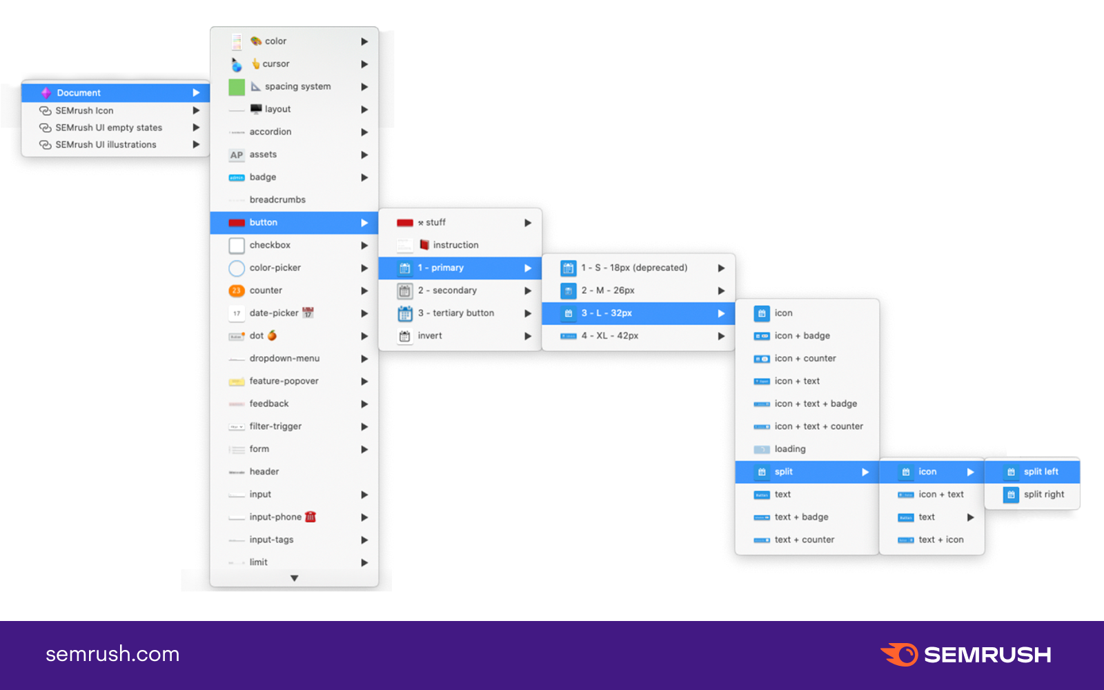
One of the designers started building a library of symbols in Sketch, kicking around and playing with crutches. Some of our components had a lot of variations, so the library was very large. And a lot of nesting in the symbols was unavoidable. In the end, some of them came out like this:
Our set of working tools changed to: Sketch → Zeplin. And we continued to store the files in Google Drive.
It took a month or two for the team to get used to working in the new tool. To do this, we held small meetings, where we gave each other tips for working with Sketch.
At the same time, we started a channel in corporate Slack to share plugins, tips, and problems. On that note, everyone was supposed to be happy and cheerful. We were for a while.
Why we decided to change the tool
In an ever-growing team, you occasionally wonder how processes can be made better: search and transfer of design files, tools that work correctly, and a good understandable component library.
At one of the team retros (there were 11 of us then, and the number of Semrush products increased to 44), we decided to discuss tools and work with files, library, and development teams.
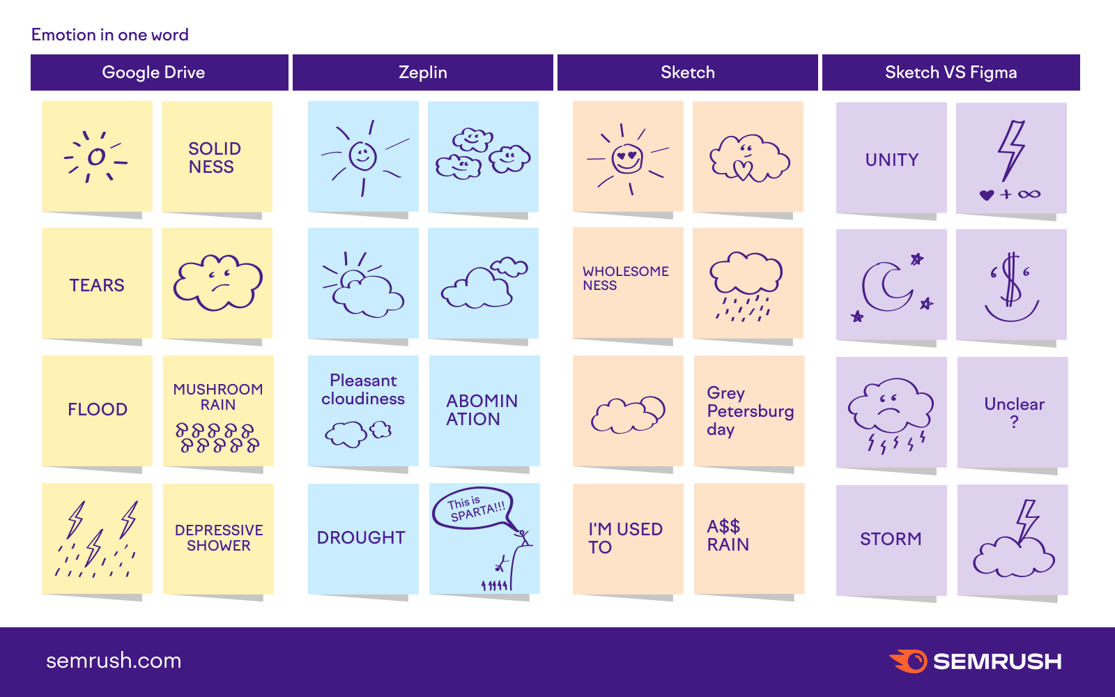
At that time, the team jokingly defined emotions for ourselves in relation to the tools we were working with:
After this warm-up, we’ve already collected several problems that have become defining for us in the transition to the new tool.
Cons of Sketch, Google Drive, and Zeplin
Google Drive
- File synchronization didn’t work well between different machines. It often resulted in duplicate sources, and of course, it was impossible to open one file and work on it simultaneously with a colleague—someone’s changes were bound to get lost.
- There were terrible cases where component libraries were duplicated, some folks lost them, and all the links between layout components and the current version were lost. This was one of the main pains of working with the library. Sketch Cloud wasn’t available at the time we were using our library (Bohemian Coding added this feature on February 28, 2018).
- Well, and the human factor, of course, because of which total entropy could occur in this or that folder.
Sketch
We loved Sketch, but we couldn’t put up with some of the things that slowed our process down.
- Breaking changes have been in almost every new version of the tool. For example, in Sketch originally, you couldn't change the color of shapes through layer properties, only through nested symbols and masks inside. In 2019, Bohemian Coding added the ability to change style colors within a symbol. That said, you couldn’t simply remove masks within an already working library, as the selected colors in the files would happily or not so happily revert to defaults. That hurts.
- A great personal pain for the designer who maintained libraries and kept them up to date was the bug with the duplication of symbols of the main library in the file. Each file created a Symbols page, where components from the main library were duplicated. Often, we had to manually re-link the symbols in the file to the symbols of the main library (ar-r-r-r!).
- The library was huge, and the components had a lot of variations. We had to put up with a lot of nesting of symbols. And it took a lot of time to support the components.
- We wanted to simplify the library, its handling and support. Remember that big nesting of components above? That’s it.
- Using nested symbols was inconvenient for some folks, as the menu with them was very small, and the thumbnails were not particularly helpful. Imagine that you just came to the team, and there is a huge library of components where everything needs to be explored and tapped.
- You couldn’t just give a link to the desired artboard and show the developer something specific when discussing it. We had to export the layout to Zeplin every time.
- Working with vectors in Sketch was convenient, but it was inferior to Adobe Illustrator in terms of setting up and correctly exporting SVG assets.
- There were often unexplained bugs and different behavior of symbols in different files on different machines.
- Some useful plugins stopped being supported with time and new versions of Sketch.
- At some point, Sketch started to “crash” more often and would lose all changes.
- There was no way to work with files on another machine (in the cloud).
- The desire to try a new tool also played a role.
Zeplin
- Zeplin displayed some symbols and elements incorrectly. It was very annoying, especially when the reasons for this behavior were not clear at all.
- The synchronization between Sketch and Zeplin was long. Sometimes, while you were uploading actual files for developers, you could have tea and see how your colleagues were doing. On repeated occasions, this was very annoying (not the tea and colleagues, of course, but Zeplin). Such a waste of time was especially frustrating when working with products that were constantly being updated and changed.
- Inside the tool, you couldn’t open multiple tabs with layouts.
- On top of all that, Zeplin was another (extra) source of truth for us in which we had to remember to keep the guides and files up to date.
- It wasn’t always convenient to show the logic of work. And the ability to link layouts into clickable prototypes appeared when we were already moving on to another toolset.
Our team was growing, there were more products (you can see the rate of growth in quantity on this page), and the number of design files and folders in Google Drive was increasing. This meant that all the problems described above could be multiplied by the number of new people. We didn’t want this to happen, so we gathered a working group within the team and outlined a plan for transitioning to Figma.
Pros of Sketch
Of course, Sketch also had its perks, which some on the team gave up reluctantly.
- There were a lot of useful and cool plugins that helped with the work. For a while, they appeared almost every week.
- Sketch had a simple and straightforward interface, which was a relief after the familiar but still cluttered interfaces of Adobe programs.
- In Sketch, it was easy to work with layers and masks.
On the whole, Sketch suited everyone but was definitely outdated in a number of features.
Preparing to switch to Figma
Transferring several component libraries from Sketch to Figma was an important step for our design team. So we assembled a working group of interested people. In addition to the main tasks, these folks were engaged in working out a transition plan to the new tool (there were five of us, three of whom had long been telling us with eyes full of passion what Figma can do).
First, we made a list of questions that we had to answer: the capabilities of the tool, the pros and cons of Sketch, the flow of work on tasks, and so on. In addition, we put together a separate listing of everything that would need to be migrated (all the basic components, icons, graphics, patterns, etc.) and who would be responsible for what part.
Our UI lead called the Figma sales team seven times, asked questions, and read their FAQs and guides. At first, Figma was more expensive for our company (taking into account the number of designers, not only UI but also UX) than Sketch. In the end, it was cheaper than Sketch + Zeplin.
A couple of development teams were already using Figma in their work. We took their experience into account and started to figure out how to combine it all for one organization without breaking anything.
Here’s a list of questions that we answered before the final decision to switch to Figma as a team. We hope you’ll find it useful.
Checklist for switching to Figma
The switching process
We had over forty components and variations of them in the main Sketch library at the time of transition. In addition to that, we had separate libraries with icons, illustrations, and patterns.
About a year or so ago, one of the designers in the working group started transferring some components from Sketch to Figma for his own convenience. We decided to use his work as a starting point. We divided the existing components between the group of three and saw which of them should be finalized in Figma and which should be built from scratch. And we gradually got on with it.
During the transfer, we wrote down for ourselves the general principles of building components, agreements on the names of layers, groups, and overall. Perhaps it would be useful for your team, too, if you happen to be transferring your libraries from Sketch to Figma.
What’s important to remember when creating a new component in Figma
General
- The main library should contain only what you need for your design work. Take all the “atomic” stuff to a separate page (we named it Atoms). “Atomic” elements are those elements that can’t function in the interface themselves.
- Nesting components: we tried to make no more than two or three subgroups. Three is the limit.
- Don’t overcomplicate components. Anything that can be combined and unified into one component, you can safely put into it. Then it will be much more convenient to edit one component than search for similar ones in all the pages of the library.
- Should we create states and component variations within one component or by separate masters? It depends on component complexity. In small and basic components, it’s convenient to put the states and variations inside and add the appropriate properties through the Variants panel. For complex and large components, it’s better to make the states in separate masters. This will reduce their weight and possible lags when working with them.
- Do not complicate the grouping of components.
Names of layers
- Inside the component, make the names of the text layers unique.
- The names of the interchangeable text layers must be the same between the components. This is necessary for easy replacement of components with each other without losing the already entered text.
Component names
- In Figma, the nesting of components in the left panel is simpler than in Sketch, so you can use less nesting, which is created with “/”.
- Name the components so that they appear in a logical order in the Assets panel. For example, dropdown or modal window states can have a sequential number at the beginning of the name.
- The underscore at the beginning of the name “_” makes the component private and visible only to library editors.
It’s important to remember when modifying an already existing component:
- If you add something new to an existing component, it’s better to hide it. Otherwise, the freshly added elements will be enabled in all component instances. And you could accidentally break something in someone else’s file.
- If you want to drastically change an existing component, delete the master you want to edit. The old master can be restored from its instances, if necessary. Create a new component master—and you won’t break anything in your colleagues’ files.
Summary
The transition of libraries from Sketch to Figma in our team took a little over a month with five people. We started on March 19, 2020, and on April 24, all the basic components and styles were ready to work. At the same time, we were still working on the main tasks, and the transition was done in the remaining time.
After transferring the components to Figma, the working group held small master classes for the folks from the UX/UI team. They talked about and showed how everything worked and was built in the library. Our UI lead gave a demo on organization in Figma for the entire product team and marketing designers.
One month after moving from Sketch to Figma, we could already see these results:
- The number of “sources of truth” for designers and developers has been reduced. Now both look at the same file and can work on it at the same time.
- It has become very easy to share design files within and between teams.
- The big problem of duplicate files and libraries on Google Drive and restoring old versions of files has gone away for us.
- The nesting and the number of layers within components have been reduced by about one and a half to two times. Libraries have become much easier and more convenient to use, develop, and maintain.
- Links to up-to-date documentation appeared on the component pages.
- Most folks now leave messages about bugs in components directly in the libraries, which does not distract the designers supporting them.
- The emergence of Variants functionality in Figma has given a cool opportunity to customize properties in design components. Similar to how it’s done in the code.
- The Figma Community has a huge number of useful plugins and resources that help with various routine tasks.Our main libraries are now available to third-party developers.

What’s next
The move to Figma met our team’s expectations. It became easier to work with the design system’s files and libraries and discuss solutions directly in the files. Even simply playing around when working together in Figma is very cool. By the way, it’s sometimes very useful!
Next, we plan to non-destructively link our design components with react components, develop libraries, and share our work in the Figma Community.